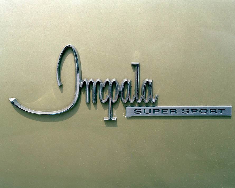
 It’s been a busy week for those of us stationed at Gaywheels South, smack-dab in the middle of New Orleans. But we won’t trouble you with harrowing stories of power outages and downed tree limbs. Instead, we’re going to lighten things up (metaphorically speaking) with a quick look at everyone’s favorite subject: fonts!
And not just any fonts: auto fonts!
Jesse Chehak is a professional photographer with a passion for documenting life in California and the great Southwest. Chehak spends part of his time in Los Angeles, which is obviously a car-crazy town. But rather than snap shots of classic rides, as many other shutterbugs do, Chehak has done something remarkable in his latest series called “Autotypes”: he’s focused on the fonts that automakers use to spell out the names of their rides.
We don’t spend a lot of time thinking about those little plaques that decorate the backsides and quarter-panels of our vehicles, but designers use them to express the essence, the character of these models. The scroll of the “E” on the Cadillac Eldorado, the sci-fi “A” at the end of the Buick Electra: they help define the car as much as the more obvious exterior and interior elements.
If you’re looking for a nice distraction this Friday, check out this short slideshow of Chehak’s work.
Enjoy your holiday weekend, and if you’re in New Orleans for Southern Decadence — which is still happening, despite the doom-and-gloom prophecies of right-wing bigots — we’ll see you on the streets!
[via Jonno]

There were some great fonts used in car badging in the 60’s. On another note . . . I’m glad you made it through Isaac safely.
Thanks, Jim. Things in New Orleans were frustrating for a couple of days, and our electric utility, Entergy, was massively unprepared for the storm, but most of the city is back on its feet and ready to get to work tomorrow! (Or today, for the many, many folks in the service industry.)