Earlier today, I posted my list of “winners” from the 2013 Detroit Auto Show. But of course, you can’t have winners without a few losers. Here’s my selection of worst offenders. Scroll to the bottom of the page for a full gallery, if you must.
THE “NO, THANK YOU, MA’AMS”
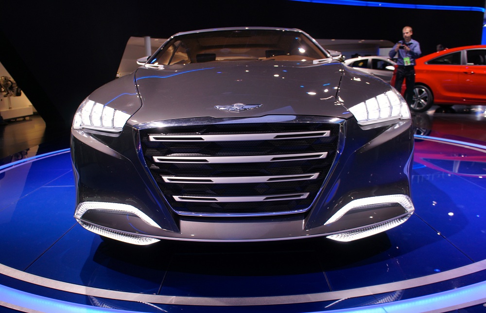
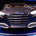
Seriously, what is this? Ugh, that face.
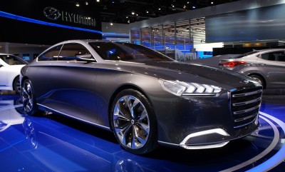
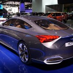
I thought Hyundai had been totally getting it lately with some gorgeous and cohesive designs like the Elantra, Azera, and Santa Fe. Well, here’s the HDC-14 Concept, featuring a front end that makes me want to tear my eyes out. It’s odd because on top, we have a rather gorgeous, Audi A7-inspired roofline, with a graceful arch and just-right windows. Yet as we stumble down the sides we come to a grill and headlight arrangement that will surely haunt your nightmares. ENOUGH.
This concept is supposed to preview the new Genesis. I doubt it will look this terrible when the production version arrives. Or maybe Hyundai is being really smart and showing us something ugly so that when the much-better-looking production version arrives, we’ll all be elated that it doesn’t look a thing like the hideous concept.
It’s funny, I have a lot of respect for the Korean automakers, who’ve made giant strides in the industry in the past few years. It just seems like they have a lot of trouble designing an attractive front end. The Veloster, the Sonata Hybrid, the Tuscon: they all have weird, catfish-derived grilles that throw off an otherwise well-executed design. I know the designers want their cars to be more distinctive, but distinctly ugly is not what you want to be known for.
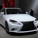
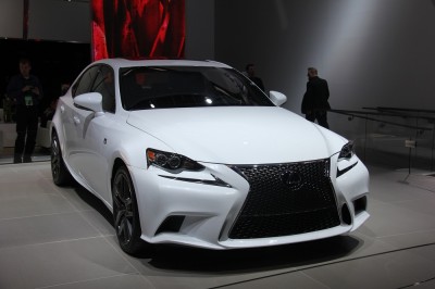 2014 Lexus IS
Oh, Lexus. I’m not even sure what to say here. I know you want to be one of the cool kids. You may even be one now, with the bizarre front end of the new IS. The only problem is that the folks lusting over your curiously designed wares will be 14-year-old PC gamers instead of the young urban professionals you want to attract. Looking like the Predator alien with really weird bifocals, the 2014 Lexus IS is aesthetically challenged, to say the least. The interior looks to be more of the same from the company, with a Yaris-like steering wheel and a weirdly plastic vibe. What more can I say? I don’t like it because it’s ugly, and that’s all, folks.
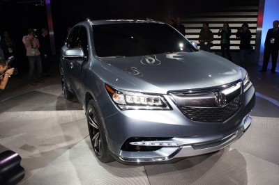
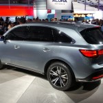
I don’t really understand WHY Acura insists on showing “prototypes” rather than concepts or real production versions. Just like 2o12, when Acura showed the RDX and ILX prototypes, this year’s MDX prototype is pretty much 100% what the production model will be.
Stylistically, it’s more dull, dull Acura — sure to not offend anyone, but if this thing quickens your pulse then you must be a Slow Loris. Looking a bit like a Japanese Dodge Durango, the MDX is entirely, appallingly predictable. It could also easily be the next Honda Pilot, which does not bode well for a brand trying to market itself as upscale.
Also, I have to say that the jeweled headlights Acura is now making a design trait look unnervingly spider-like in person — like this thing is watching you with ALL its eyes, and it’s big ol’ beak mouth is HUNGRY. Beware.
