Last week’s 2013 Detroit Auto Show was a whirlwind of premieres and press conferences. Thankfully, the long, three-day weekend gave me time to reflect and choose some winners and losers of the lot.
Below, you’ll find my best-in-show list. Scroll to the bottom of the page for a full gallery — and stay tuned this afternoon for the, um, not so fortunate.
THE “YES, PLEASE-ES”
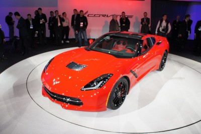
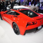
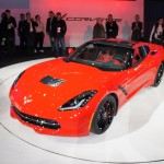
Behold: the new, 2014 Chevrolet Corvette Stingray. It’s still a Corvette, only now it wants you to mistake it for a Ferrari. Not a bad thing.
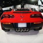
The 2014 Chevrolet Corvette looks great in person, with a much more sculpted and intricate design than the last generation C6. The rear is especially changed, as Chevy has ditched the ubiquitous circular taillights and replaced them with some highly three-dimensional units, compete with “crying chola” tear-drop tattoo vents on each side. They look far better than my description may make them seem. (Scroll down to see them in the gallery.)
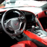
The interior is also a vast improvement on the truly horrible, econo-car interior of the previous, C6. The new interior is focused toward the driver — fitting for a super serious sports car. In fact, the controls are SO canted toward the driver that Chevy has provided the passenger with her own adorable set of climate and seat controls right below the right hand air vent. Awwwww.
I DO take issue with Chevy calling this iteration of the Corvette a Stingray though. Using that hallowed name is going to make many a baby-boomer’s eyes pop-out with anticipation, so I’m sure it’s a smart marketing move; I’m just not convinced this design truly says “Stingray.”
One area in which you won’t be mistaking the Corvette for a Ferrari is the price. Expect this puppy to start around $50,000 when it goes on sale later this year, and THAT my friends is what I like to call American ingenuity.
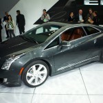
The extended-range electric Chevy Volt was a great start but let’s be real: it lacked the glamour to really set people’s hearts afire. Of course debuting the Voltec technology on its mainstream brand was a deliberate move on GM’s part, seeking to make the point that the future of alternative propulsion was not going to be reserved for the rich.
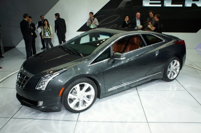
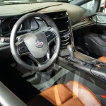
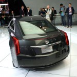
Well, guess what, you patient rich people: your extended range electric car is finally here! Was it worth the wait? Well just look at it. Let me answer for you: YES. The ELR is a clear evolution of the current Cadillac design language, with sharp creases married to soaring, fluid shapes. It works really well on the ELR and gives this car the visual gravitas it needs to turn heads. Of course those stunning (and standard?!) 20-inch rims add to the feeling every time you glance at the ELR. Inside, the ELR expands on Cadillac themes we’ve seen as well, though the materials and execution seem even richer than in the lesser models.
In my heart of hearts, though I really wish Cadillac had called this an “El Dorado.” I know I’m going to get people yelling that that’s an old person’s name, but whatever. It was badass sounding then, and it’s badass sounding now.
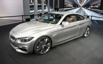
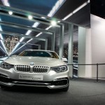
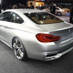
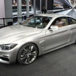
Stylistically, BMWs are still recovering from the wounds wrought upon them by Chris Bangle. Squawk all you want: Bangle’s designs for the Bavarian performance powerhouse may have been interesting, but they certainly weren’t attractive. Thankfully, the brand has been making a recovery and the new 4-Series concept shows BMW is pushing its design back into the realms of attractiveness.
Interesting and muscular side-detailing fits the demeanor of this compact sport coupe concept. My only real concern here is with that face. It’s a bit gawky in person and leans a little too forward and down resulting in an awkwardly dorky gaze. Also: too bad about the interior, which is shared with the standard 3-Series sedan, making it a bit downmarket compared to the competition.
Still, this is a solidly attractive entry for BMW, something that has been sorely missing from this company in the past decade. More like this please.
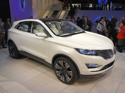
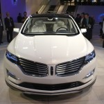
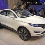
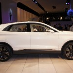
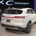
The unveiling event for the Lincoln MKC was freaking bizarre. It was all pretty and nice until they opened the box containing the new crossover concept, and two young women emerged carrying long scarves covering the MKC Concept. It was like Cleopatra coming to Rome. Hopefully, unlike Cleopatra, the Lincoln MKC crossover won’t bring ultimate death and destruction to the the Ford empire. I certainly don’t think it will, because the Lincoln MKC Concept looks fantastic.
The MKC Concept offers a very clear glimpse of what the production Lincoln MKC crossover will look like when it hits the market in what I’m guessing will be about a year. A very well-conceived design, the Lincoln MKC includes a successful application of the brand’s new “flying” grill, as well as its newly re-adopted trademark full-width tail lights. So long as the proportions are maintained for production, Lincoln should have a winner on its hands. If Lincoln is smart, it’ll also include a hybrid version to entice some Lexus loyalists over to Lincoln-land.
Sidenote: I got the chance to speak with Soo Kang, the Korean born designer for the MKC (and MKZ) interior. She was a delight: funny, open, and genuinely excited about the product she help design. When asked about where the “champagne bubble” leather perforation pattern from the MKZ concept went in the production model, she assured me that she was working on something even cooler for the future that would indeed make it to production. Color me very intrigued.
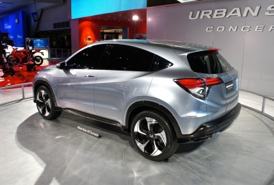
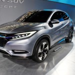
The Honda Urban SUV Concept was a pleasant surprise at the show. Like it or not, Americans still have a taste for things called “SUV” and “crossover”, and Honda wants as big a piece of that pie as they can get. The Urban SUV Concept foreshadows what we can expect from their upcoming Fit-based crossover. It’s a pleasant little porker with clean styling and good proportions. Let’s hope they keep all of that for the production version.

